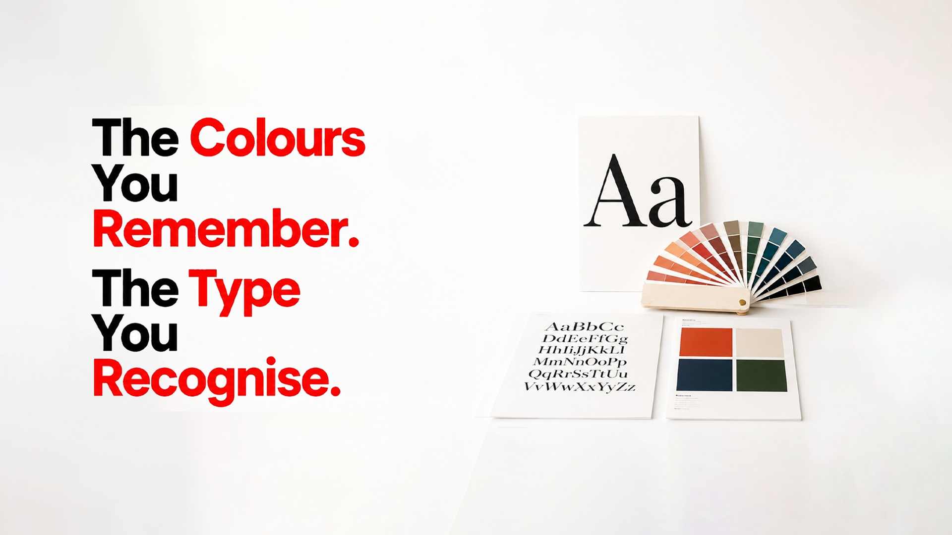
Colour and typography shape every brand touchpoint. We build both strategically to strengthen recognition and visual consistency.

Define your primary brand colours with complete specifications for consistent use across print and digital media.

Develop a complete colour palette with primary, secondary, and neutral colours, plus clear usage guidelines for every brand touchpoint.

Establish clear colour proportions for primary, secondary, and accent colours across every touchpoint.

Select a primary brand typeface that balances personality, readability, and consistency across print and digital.
Create a complete typography system with clear styles, sizing, spacing, and hierarchy for consistent brand communication.

Deliver complete colour and typography specifications for consistent use across digital and print.
Choosing the right colours and typography creates a stronger, more consistent brand identity that performs over the long term.
Our colour choices are guided by colour psychology to create the right emotional connection with your target audience.
We provide complete colour codes for digital, print, packaging, and production to ensure brand consistency.
We analyse competitor colour usage to develop a unique palette that strengthens your brand identity.
We test colour palettes and typography across every application to ensure clarity, consistency, and scalability.
Our process follows a clear framework with strategic guidance, defined deliverables, and transparent execution.
Review your brand strategy, target audience, archetype, and approved mood board before defining colours and typography.
Define a colour strategy that reflects your brand personality, stands out from competitors, and strengthens brand recognition.
Select, refine, and test your primary brand colour across digital and print, with complete technical specifications.
Build a complete brand colour palette with secondary and neutral colours, usage guidelines, and digital and print specifications.
Select primary and secondary typefaces, create a complete typography hierarchy, and provide print and digital specifications.
Everything you need to know before starting your colour palette & typography project.
Colour and typography are the most frequently used visual elements of a brand, creating recognition, consistency, and a strong brand identity across every touchpoint.
We define a colour strategy based on your brand positioning, target audience, colour psychology, competitor analysis, and differentiation opportunities.
You receive a complete colour system with primary, secondary, and neutral colours, usage hierarchy, and technical specifications for digital and print.
We deliver complete colour specifications, including HEX, RGB, CMYK, and Pantone, for consistent implementation across all media.
We choose primary and secondary typefaces based on your brand personality, readability, scalability, and performance across digital and print.
The typography system includes font selection, hierarchy for headings and body text, sizing, spacing, weights, and implementation guidelines.
Yes. Every colour palette and typography combination is tested across digital, print, packaging, and different display sizes to ensure consistency and readability.
Yes. We provide detailed colour codes, typography specifications, hierarchy rules, and usage guidelines to ensure consistent brand application across every touchpoint.
Share your brand direction and we'll build the colour and typography system that makes your brand instantly recognisable and consistently beautiful.